

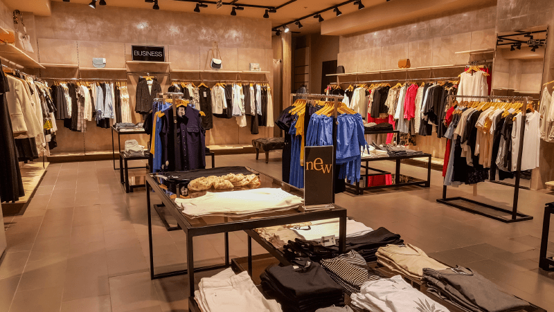
Outlet stores occupy a unique niche in the retail landscape. Unlike traditional flagship boutiques that focus on elegant restraint and curated exclusivity, outlet centers thrive on abundance, velocity, and the thrill of the hunt. Shoppers enter outlet stores with a distinct mindset, often expecting steep discounts, expansive inventories, and a treasure-hunt atmosphere where patience is rewarded with hidden bargains.
Behind the apparent chaos of rolling bins, towering racks, and massive discount banners lies meticulous architectural planning. Retail designers and store planners use environmental psychology and spatial arrangement to gently guide customer movement, maximize dwell time, and stimulate purchasing decisions. Understanding how these physical environments manipulate traffic and attention reveals the hidden science behind retail design.
The Psychology of Space and Architectural Flow
Spatial design directly dictates how humans move and behave within a commercial environment. When shoppers enter an outlet store, their physical navigation is rarely random. Architects and visual merchandisers engineer floor plans to control the speed, direction, and focus of every visitor.
Outlet stores often handle exceptionally high foot traffic compared to standard retail locations, requiring layouts that prevent bottlenecks while encouraging thorough exploration. Key psychological tactics used in spatial planning include:
- Managed Circulation Paths: Designing clear pathways that gently curve or snake through the store, forcing shoppers to pass a greater volume of merchandise than they originally intended to view.
- Open Sightlines: Keeping central sightlines open so customers can catch glimpses of distant clearance signs or popular categories, drawing them deeper into the interior.
- Controlled Compression Zones: Alternating between wide, comfortable aisles and narrower, dense product areas to subtly alter walking speeds and increase dwell time near high-margin items.
By dictating the physical flow of traffic, retailers ensure that shoppers are constantly exposed to promotional messaging and new product categories throughout their visit.
The Decompression Zone and Initial Threshold
The first ten to fifteen feet inside the entrance of any retail store is known in the industry as the decompression zone. In outlet stores, this threshold area carries immense psychological weight because it serves as the transition point where customers shift from the outside world into a shopping mindset.
Shoppers crossing this threshold are adjusting to the lighting, ambient temperature, and visual noise of the store. Successful outlet layouts avoid placing high-priority merchandise or critical sales items immediately inside the doorway. Instead, this zone acts as a breathing space where visitors can pause, orient themselves, and absorb the scale of the store.
Retailers utilize this space to establish the brand tone and highlight overarching promotional themes. Large graphic banners announcing percentage-off thresholds, seasonal clearance events, or store-wide markdowns are typically positioned here to anchor expectations before the customer takes their first step into the main shopping floor.
Grid versus Free-Flow Layouts in Outlet Environments
Different sections of an outlet store often require distinct floor plan configurations to match the specific nature of the inventory being sold. While traditional department stores rely heavily on rigid grid layouts, outlet stores frequently blend multiple layout styles to balance efficiency with discovery.
Common architectural layouts found in successful outlet environments include:
- The Free-Flow Layout: Used extensively in apparel and accessory sections, this non-linear design allows shoppers to wander organically between scattered circular racks and display tables, mimicking an open-air market or bazaar.
- The Straight-Line Grid Layout: Frequently implemented in footwear and home goods sections, where organized rows of shelving and boxes make it easy for shoppers to scan sizes and serial numbers systematically.
- The Loop Layout: A continuous racetrack pathway that circles the perimeter of the store or major departments, ensuring that visitors pass key focal displays on their journey from entrance to checkout.
Combining these structural frameworks prevents visual fatigue and keeps the shopping experience engaging, encouraging customers to stay longer and explore deeper into secondary rooms or rear corners.
Strategic Product Placement and Sightlines
Product placement within an outlet store is governed by strict merchandising principles designed to maximize average transaction values. Because outlet inventory often includes a mix of manufactured-for-outlet goods and past-season clearance items, placement strategy helps balance profitability with inventory clearance.
High-margin items and newly arrived collections are typically positioned at eye level along the primary perimeter walls and main aisles, where natural eye movement falls first. Conversely, deep-discount clearance bins and final-sale racks are often placed toward the rear of the store or in perimeter corners.
This placement strategy forces bargain hunters to walk past full-price or moderate-discount merchandise on their way to the clearance section, significantly increasing the likelihood of unplanned add-on purchases. Additionally, complementary items are merchandised in close physical proximity, pairing graphic tees with denim or matching wallets with handbags to encourage multi-item baskets.
The Power of Impulse Zones and Checkout Queues
The journey through an outlet store culminates at the cash wrap, an area that represents the final and most critical conversion zone. While customers wait in line to complete their purchases, their physical movement slows down completely, creating a concentrated period of stationary observation.
Retailers capitalize on this captive audience by transforming checkout queues into high-density impulse shopping zones. Surrounding the queue pathways are carefully curated displays of low-ticket, high-margin accessories:
- Grab-and-Go Accessories: Items like socks, keychains, sunglasses, phone cases, and cosmetics that require minimal evaluation before purchase.
- Travel-Sized Essentials: Miniaturized versions of popular beauty products or travel gear that appeal to impulsive, low-risk spending behavior.
- Checkout Impulse Bins: Open baskets filled with novelty items or clearance stocking stuffers positioned at eye level right as the customer approaches the register.
Because the decision to buy these smaller items requires very little cognitive effort, shoppers frequently add them to their baskets at the last possible second, boosting overall transaction values.
Lighting, Signage, and Spatial Cues
Physical layout extends far beyond floor plans and fixture placement; it encompasses sensory elements like lighting intensity, color temperatures, and dynamic signage. In outlet stores, lighting is often used as an invisible compass to highlight promotional zones and differentiate product tiers.
Brighter, focused spotlighting is frequently directed toward premium collections and new arrivals, creating a perception of higher quality. Softer or more generalized lighting is applied to deep clearance zones, where the focus shifts entirely to volume and price value.
Signage plays an equally vital role in navigating the physical space. Clear, bold typography detailing percentage-off tiers and category markers prevents customer frustration and keeps traffic moving smoothly. When shoppers can easily locate their size or find the discount threshold without asking for assistance, they remain in a positive, relaxed shopping state that favors higher conversion rates.
Frequently Asked Questions
Why do outlet stores often feature maze-like layouts instead of straight aisles?
Maze-like layouts, often referred to as free-flow or grid-breaking designs, are intentional choices designed to slow down customer movement. By eliminating direct sightlines and straight paths, retailers encourage shoppers to wander past a wider variety of merchandise, increasing exposure to impulse items and boosting overall sales.
How do outlet stores handle high foot traffic without causing shopper frustration?
Outlet stores manage heavy foot traffic by designing wider primary aisles near the entrance and main corridors, while reserving tighter spacing for secondary clearance bins. This tiered pathway system allows fast-moving visitors to bypass browsing crowds while giving dedicated bargain hunters room to sort through inventory.
What is the purpose of placing clearance sections at the very back of the store?
Positioning clearance sections at the rear of the store forces shoppers to walk past new arrivals and full-price inventory on their way to the bargains. This architectural strategy maximizes visual exposure for high-margin products and often converts dedicated clearance hunters into buyers of regular-priced merchandise.
How does lighting intensity influence buying behavior in retail environments?
Lighting intensity directly affects mood and perceived product value. Warm, high-intensity spotlighting enhances the texture and color appeal of premium garments, signaling higher quality. Brighter, diffuse overhead lighting is typically used in discount zones to emphasize clarity, legibility of pricing, and sheer volume of stock.
Why are smaller items always placed near the cash register queue?
The cash register queue forces shoppers to stand still in a slow-moving line, creating a period of waiting where attention naturally drifts to nearby surfaces. Placing low-cost, high-margin impulse items within arm reach capitalizes on this stationary waiting time to drive effortless last-minute purchases.
Do outlet store layouts change frequently based on inventory turnover?
Outlet stores experience rapid inventory turnover compared to traditional retail boutiques, meaning floor layouts and fixture placements are adjusted regularly to accommodate new shipments. However, foundational traffic paths and anchor department locations generally remain consistent to maintain predictable customer flow.
How do physical mirrors and dressing room placement affect outlet conversions?
Dressing rooms are strategically positioned deep within the sales floor or near high-margin departments rather than near the entrance. This placement forces shoppers to carry potential purchases across the store, exposing them to additional displays and increasing the likelihood of picking up extra items to try on together.